

What to Wear for Fall Family Photos: An Easy Guide to Choosing Your Color Palette
Family photo season is here, and with it comes one of the questions we hear every year: What should everyone wear?
Whether you are planning autumn family pictures, your annual holiday card, or simply taking advantage of the beautiful light this time of year, dressing the entire family can quickly become overwhelming.
Our advice? Start with a color palette, not a theme.
You don't need everyone in matching outfits. You don't need orange because it's fall. And you definitely don't need to dress your family in red and green just because the pictures will end up on a Christmas card.
Some of our favorite family looks are actually the ones that feel the least "themed."
Over the years, we've helped many of our Rincon families put together outfits for family sessions, including our friends Mafe Navarro (Miami) and Andrea from Love & Gandules (Puerto Rico).
And although every family, location and photo session is different, we tend to follow the same simple approach.
Here's how we do it.
1. Start With a Color Palette
Before choosing individual outfits, choose three or four colors that work beautifully together.

We usually like to start with a grounding neutral, add one dominant color and then introduce one or two softer accent colors.
For autumn, that could look like:
-
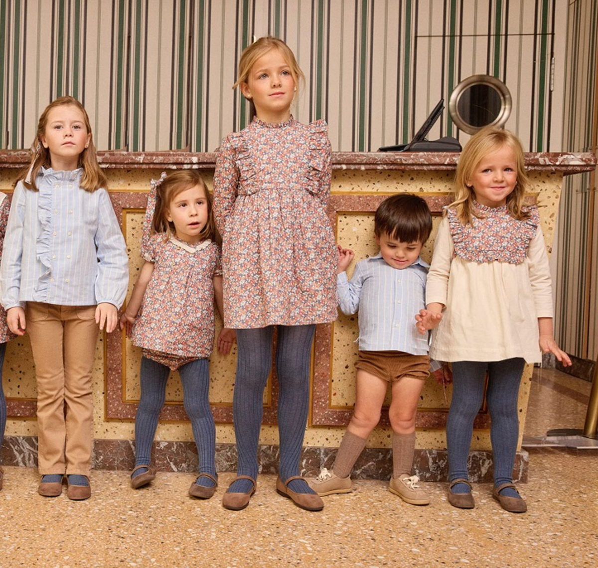
Chocolate + ivory + dusty blue + camel
-
Burgundy + blush + cream + taupe
-
Forest green + oatmeal + navy + soft blue
-
Caramel + ivory + muted pink + chocolate
The colors don't all have to appear in every outfit. In fact, we prefer when they don't.
Think of the family as one complete picture. One child might be wearing a print that incorporates two or three colors from your palette, while another wears a solid knit and another a softer neutral.
Once everyone is standing together, the colors connect.
Coordinate. Don't match.
2. Choose One Outfit You Love... Then Build Around It
You don't have to figure out six outfits at the same time.
Start with one.
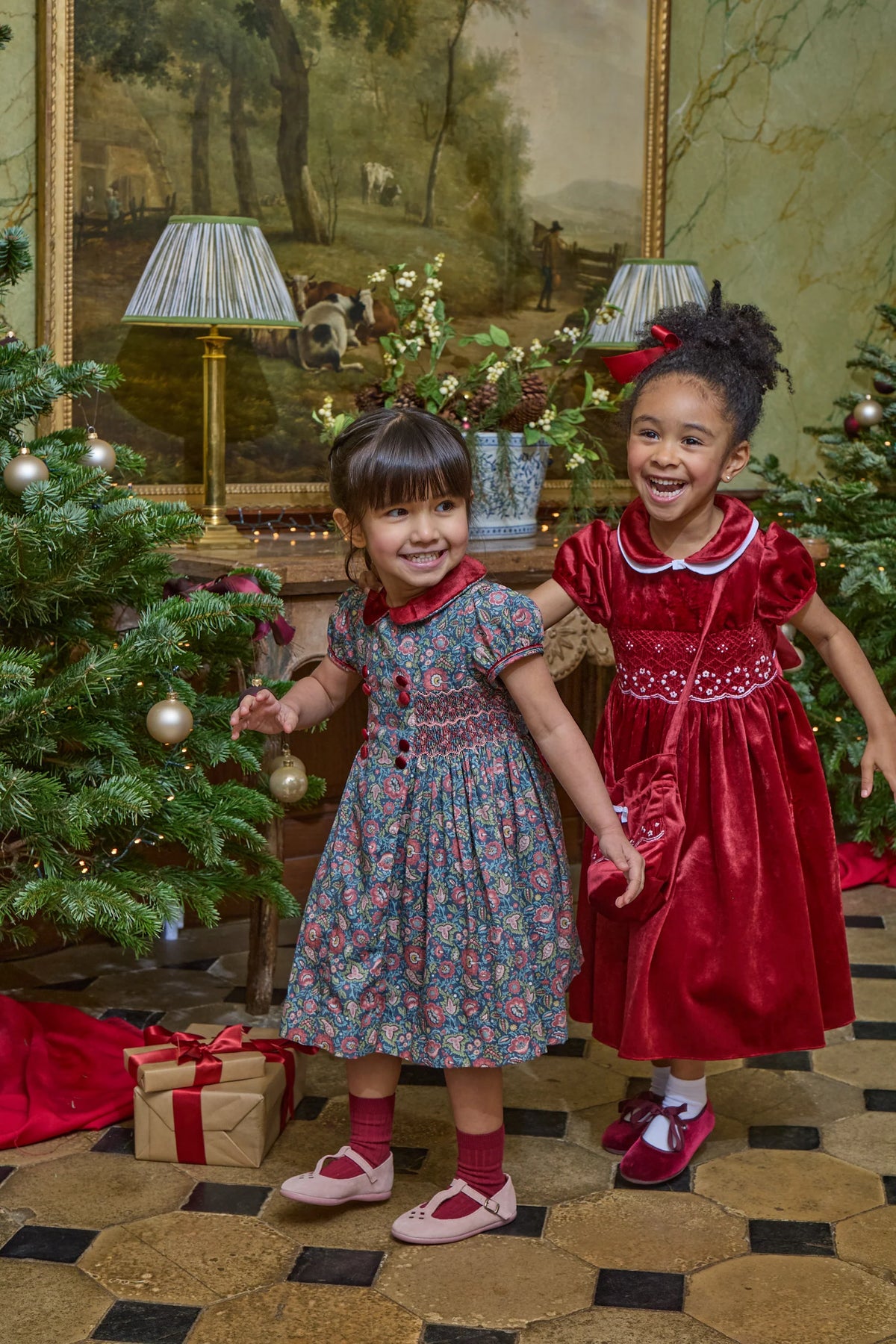
Maybe it's your daughter's beautiful floral dress. Maybe it's a little boy's chocolate knit. Maybe it's Mom's burgundy dress that she already knows she wants to wear.
That becomes your anchor.

Look at the colors in that first piece and begin pulling shades from it for everyone else.
A floral dress with burgundy, dusty pink and green, for example, doesn't mean her brother needs a matching floral shirt. He could wear a cream shirt with chocolate trousers. Another sibling could wear a dusty pink knit. Dad might wear navy or camel.
The connection is in the palette — not in identical clothing.

This is one of the easiest ways to make family photos look intentional without looking overly styled.
3. Let Texture Do Some of the Work
One of our favorite ways to make a family palette feel interesting is through texture.
Instead of adding more colors or prints, mix:
Knits. Corduroy. Velvet. Embroidery. Wool. Soft cotton. Subtle florals. Tartan or checks in small doses.

This is particularly beautiful for autumn and winter photographs because texture gives you that feeling of the season without having to rely on obvious seasonal colors.
An oatmeal knit next to a burgundy velvet dress and chocolate corduroy can say "autumn" far more beautifully than putting everyone in orange and plaid.
4. Fall Doesn't Have to Look Like "Fall"
This might be our biggest piece of advice.
You do not have to dress your children like a pumpkin patch because your photos are being taken in October.
Fall is so much more than orange, rust and brown.
Chocolate can feel autumnal.
Burgundy can feel autumnal.
Dusty pink with camel can feel autumnal.
Navy, cream and chocolate can feel autumnal.
Even pale blue can work beautifully for fall when you ground it with deeper tones and seasonal textures.
Instead of asking, "Is this a fall color?" ask yourself:
"Does this palette feel right together?"
You'll have much more freedom — and you'll probably love the photographs for much longer.

5. Dress for Where You Actually Live
This one is especially important for our Florida, Puerto Rico and warm-weather families.
Your family photos can have an autumn feeling without pretending you live somewhere cold.
When we helped Mafe Navarro in Miami with her fall photoshoot styling, the climate naturally had to be part of the conversation.
You don't need heavy sweaters, coats and boots to create a beautiful autumn palette.
Instead, use the colors of the season while keeping the fabrics and silhouettes appropriate for your location.
A lightweight ivory blouse, caramel shorts, a dusty floral dress and classic shoes can create exactly the mood you're looking for without anyone melting five minutes into the session.
The same goes for our Miami families.
Use the season as inspiration, not as a costume.

6. Don't Forget the Shoes and Socks
We know. They're at the bottom of the picture.
But they matter!
Shoes and socks are actually one of the easiest ways to tie a family palette together.
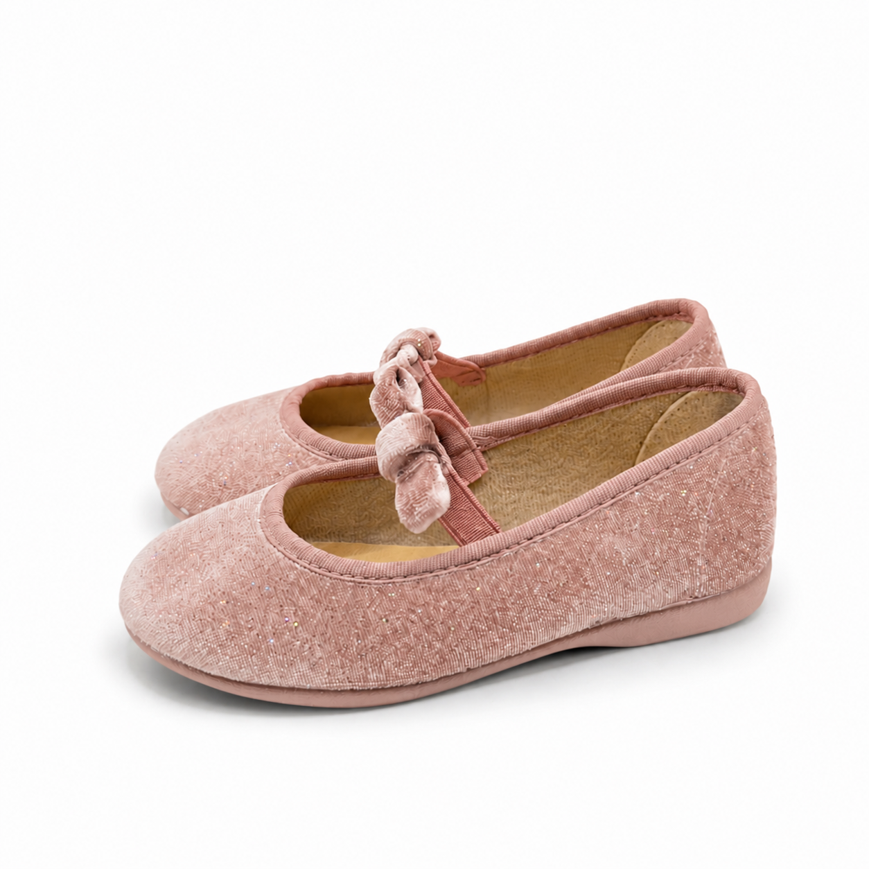
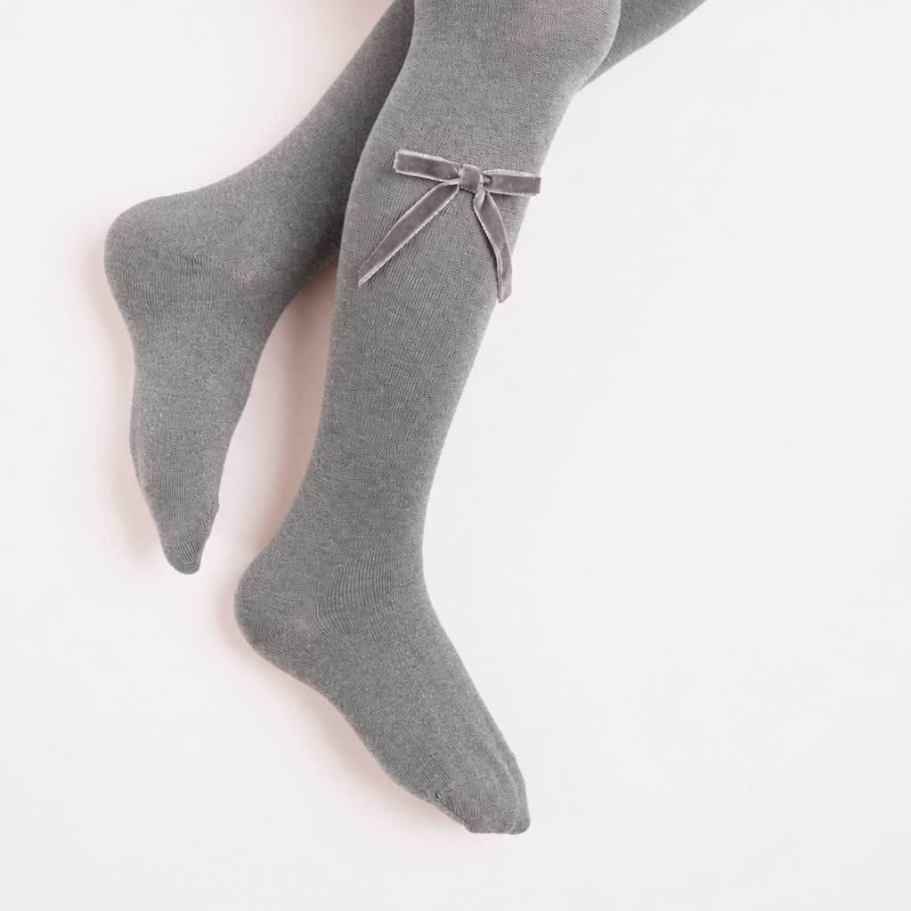
Chocolate Mary Janes can pick up the brown in a brother's trousers. Burgundy socks can connect with the tiny burgundy flowers in a sister's dress. A neutral shoe can soften an outfit that already has plenty going on.
They are small details, but in a beautifully styled photograph, those details make a difference.
Check out our autumn shoes & socks here!
7. Holiday Doesn't Have to Mean Red and Green Either
The same philosophy carries beautifully into holiday photos.
There is absolutely nothing wrong with traditional Christmas red and green — we love them! — but they aren't your only options.
Try:
Burgundy + blush + ivory
Soft, romantic and festive without being overly Christmas.
Chocolate + cream + velvet
Warm, elegant and beautiful for both autumn and holiday photographs.
Navy + pale blue + ivory
Classic and wintery, particularly beautiful for boys and families who prefer cooler tones.
Deep green + camel + ivory
Seasonal and sophisticated without putting everyone in Christmas prints.
And here's another advantage: when you choose a palette rather than a Christmas theme, your children can wear those pieces again throughout the season.
Here is Mafe's mood board and we think she works this to perfection:

Our Easy Family Photo Formula
If you're staring at everyone's closets and don't know where to begin, remember this:
Choose one piece you absolutely love.
Pull three or four colors from it.
Use those colors throughout the family.
Mix solids, one or two subtle prints and different textures.
Don't put every color on every person.
Choose shoes and accessories that connect the looks.
Then stop.
You don't need another bow, another print or another matching sweater.
Sometimes the hardest part is knowing when the family is coordinated enough.

The Most Important Part
At the end of the day, these photographs are about your family — not the clothes.
Children move. They wrinkle things. Someone will probably refuse to stand where they're supposed to. A bow might end up crooked. A shirt may come untucked.
Take the picture anyway.
We love beautiful children's clothing because it gets to become part of these memories, but perfection was never the point.
Choose clothes that feel like your children. Pick a palette you love. Let everyone coordinate without looking identical.
And then enjoy the beautiful chaos on the other side of the camera.
Because years from now, that's the part you'll want to remember.
Need Help Putting Your Family's Looks Together?
Still not sure where to start? We’d love to help. Our personal shopping service is here to make dressing your little ones for family photos easy — from choosing the right color palette to coordinating siblings, finding the right sizes and adding those final shoes and accessories. Simply email us at info@shopelrincondemaria.com and tell us a little about your family, your photo session and what you have in mind. We’ll help you put together looks that feel coordinated, timeless and, most importantly, like your family.
LOVE AND GANDULES STYLING LIST

Written by Ana Maria Certain
Leave a comment
This site is protected by hCaptcha and the hCaptcha Privacy Policy and Terms of Service apply.